David McCoy, Ph.D.
Statistician. Researcher. Artist.
By day, I work on clinical trials for artificial heart valves — devices for people in severe heart failure whose bodies are giving out. The patients in my studies are facing the worst outcome there is, and the statistics I write help determine whether a new valve will give them more time. It's precise work.
My training is in causal inference and targeted learning — I did my Ph.D. at UC Berkeley, building statistical methods for understanding cause and effect in complex systems. Before that, I studied philosophy and cognitive neuroscience. I've always been drawn to how things connect — how the structure of a system reveals something about what it does, what it means.
The honest truth is I've never been naturally gifted at math. Compared to my colleagues at Berkeley, I was the one who had to draw things out — literally sketch the geometry of a problem before I could understand it. That turned out to be the whole point.
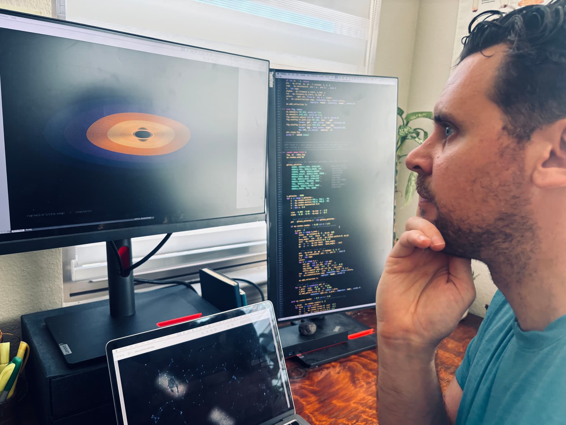
Over ten years ago, I had a simple idea: a circle sitting on top of a parabolic curve. Just that. It looked like solitude to me — a single form resting in a basin, alone but stable. I started sketching more: what does grief look like as a function? What shape does connection take? I realized quickly that coding these — the way I'd been trained to build statistical models — was the right medium. Python, not pencil.
So I started building. I collected equations the way other people collect records — exponential decay for grief, coupled oscillators for connection, L-system branching for growth. Each one a mathematical system that genuinely behaves the way an emotion does.
This became my craft. Something that made me feel like a kid again — at play, using everything I'd learned, but pointed in a completely different direction.
These pieces are all a product of that journey. I'm happy to share them in a world that feels increasingly confusing and flooded with AI-generated noise. This is intentional work that tries to cut through — to get back to what is fundamentally human: the mathematical language of the universe and the experience of being alive in it.
The Work
How Each Series Is Made
It always starts with the emotion. I sit with it, study it — what does this feeling actually do over time? Then I go looking for the math that behaves the same way. Once I find it, I write Python code and render thousands of parameter variations: different palettes, densities, compositions. Most of them get rejected. The ones that survive pass one test — they make me feel the thing they claim to represent.
The Code
# GRIEF — Settling
# f(t) = e^(-λt) · cos(ωt)
t = np.linspace(0, 1, 2000)
lam = 3.5   # decay rate — how fast grief fades
omega = 22  # frequency — how often it returns
ys = baseline + PH*0.44 * np.exp(-lam*t) * np.cos(omega*np.pi*t)
The decay rate (λ) controls how fast the waves shrink. The frequency (ω) controls how often grief returns. I chose the parameters because they felt true.
No AI Generated Images
Every line in every piece traces back to an equation I wrote by hand in Python. No image generators, no style transfer, no prompts. The equation at the bottom of each piece isn't a label — it's the reason the image looks the way it does.
By the Numbers
Thousands
of renders across all series
79
pieces that survived curation
19
human emotions explored
100s
of hours of mathematical research
The Standard
The final question I ask of every piece: if this were hanging in a gallery with no label, would someone stop and feel something?